Information Architecture · Documentation · Cisco Webex
Information Architecture · Documentation · Cisco Webex
Momentum Design System Website
Momentum Design System Website
Momentum Design System Website
Momentum Design Systems Team
Component Design & Documentation
2024
UX/Web Design
Momentum Design Systems Team
Component Design & Documentation
2024
UX/Web Design
Momentum's documentation site was years out of date. Designers were referencing obsolete guidelines and finding out only after launch. With the component rebrand underway, the site needed to be rebuilt as the true single source of truth — and it needed to be maintainable by designers without engineering help.
Momentum's documentation site was years out of date. Designers were referencing obsolete guidelines and finding out only after launch. With the component rebrand underway, the site needed to be rebuilt as the true single source of truth — and it needed to be maintainable by designers without engineering help.
Momentum's documentation site was years out of date. Designers were referencing obsolete guidelines and finding out only after launch. With the component rebrand underway, the site needed to be rebuilt as the true single source of truth — and it needed to be maintainable by designers without engineering help.
Momentum Design Systems Team
Component Design & Documentation
2024
UX/Web Design
Momentum Design Systems Team
Component Design & Documentation
2024
UX/Web Design
goals
GOALS
goals
· Single source of truth - One place for all designers, engineers, and stakeholders across all Webex products.
· Scalable IA - Organize component docs and guidelines into a logical, expandable structure.
· Designer-owned publishing - Designers update and maintain content without needing engineering help.
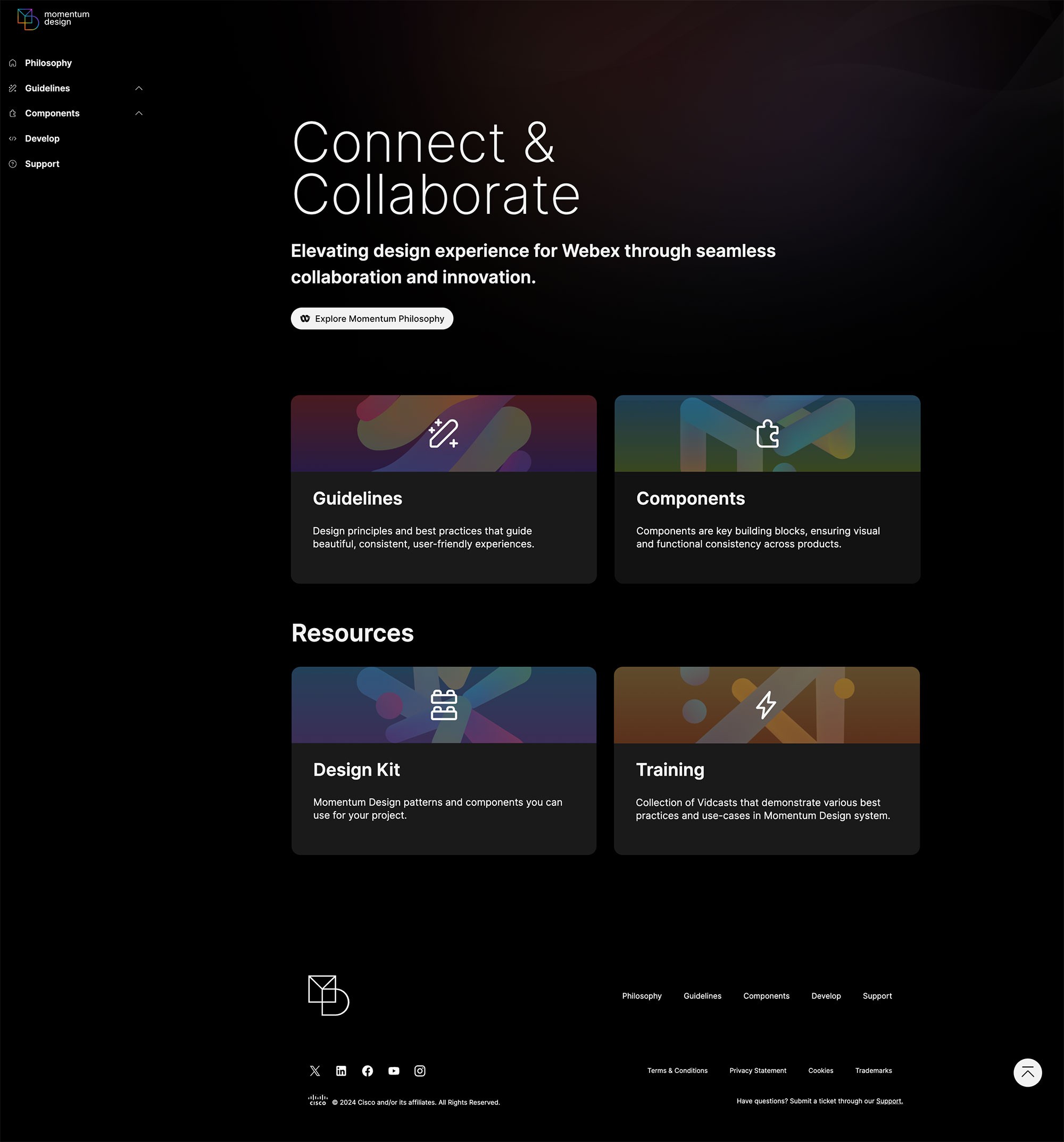
· Modern design - Align the site visually with the Momentum rebrand — dark mode as default.
· Single source of truth - One place for all designers, engineers, and stakeholders across all Webex products.
· Scalable IA - Organize component docs and guidelines into a logical, expandable structure.
· Designer-owned publishing - Designers update and maintain content without needing engineering help.
· Modern design - Align the site visually with the Momentum rebrand — dark mode as default.
PLANNING
PLANNING
PLANNING
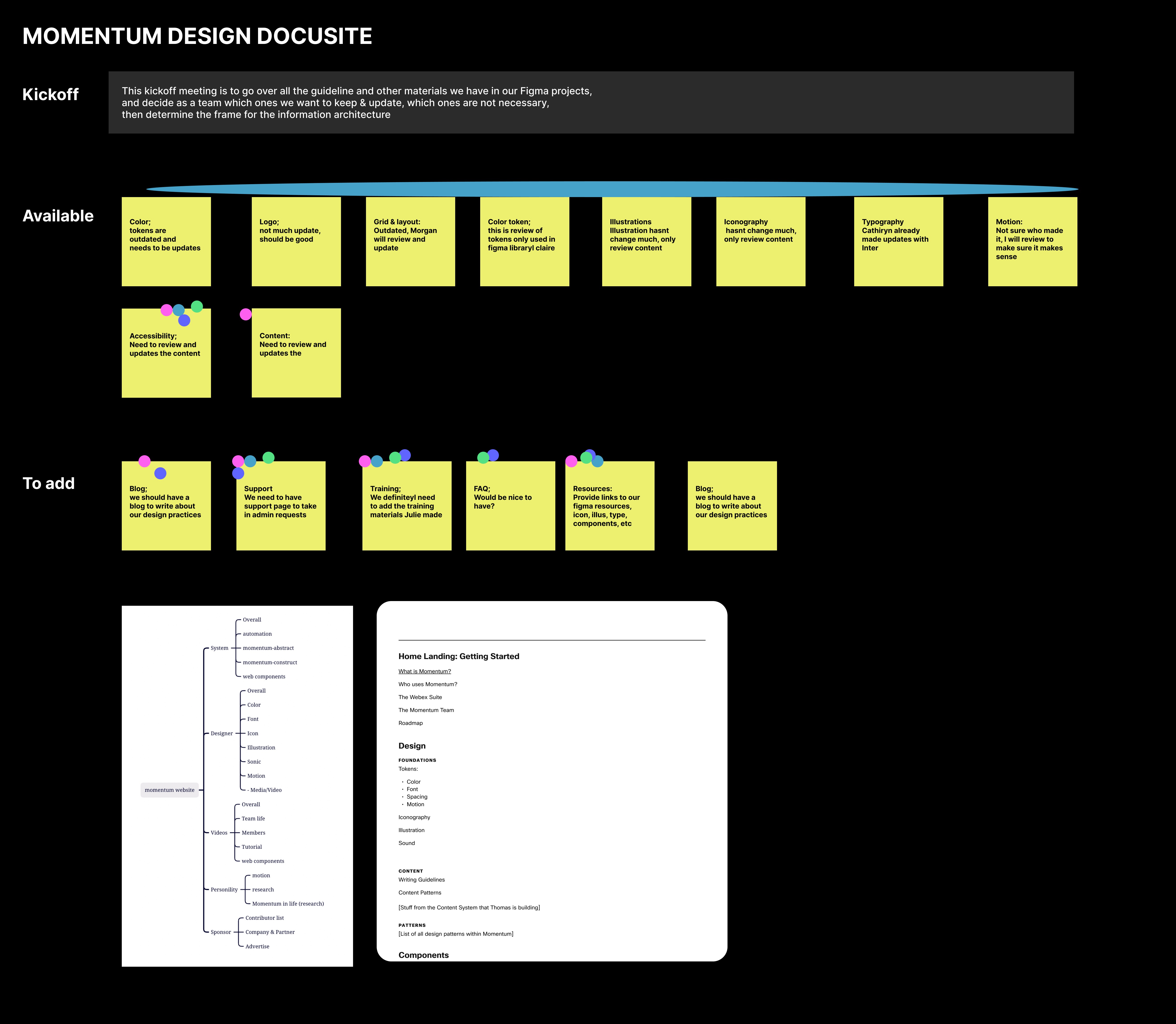
As the sole designer on the project, I kicked off with a team meeting involving all designers who had contributed to the current site — deciding what to keep, what to discard, how to organize content, and establishing a sprint timeline.
We divided components into sprints so the site could launch before the full rebrand was complete — a critical decision that kept the project moving without blocking on other teams.
Research & strategy
Research & strategy
Research & strategy
We audited what we had, identified what was missing, and studied how leading design systems handled documentation.
We audited what we had, identified what was missing, and studied how leading design systems handled documentation.
We audited what we had, identified what was missing, and studied how leading design systems handled documentation.
what we have
Components + guidelines. Grid, logo, color, type, motion, a11y — all outdated.
Components + guidelines. Grid, logo, color, type, motion, a11y — all outdated.
Components + guidelines. Grid, logo, color, type, motion, a11y — all outdated.
What we need
Updated guidelines, new content owners identified, sprint plan for completion.
Updated guidelines, new content owners identified, sprint plan for completion.
Updated guidelines, new content owners identified, sprint plan for completion.
What others have
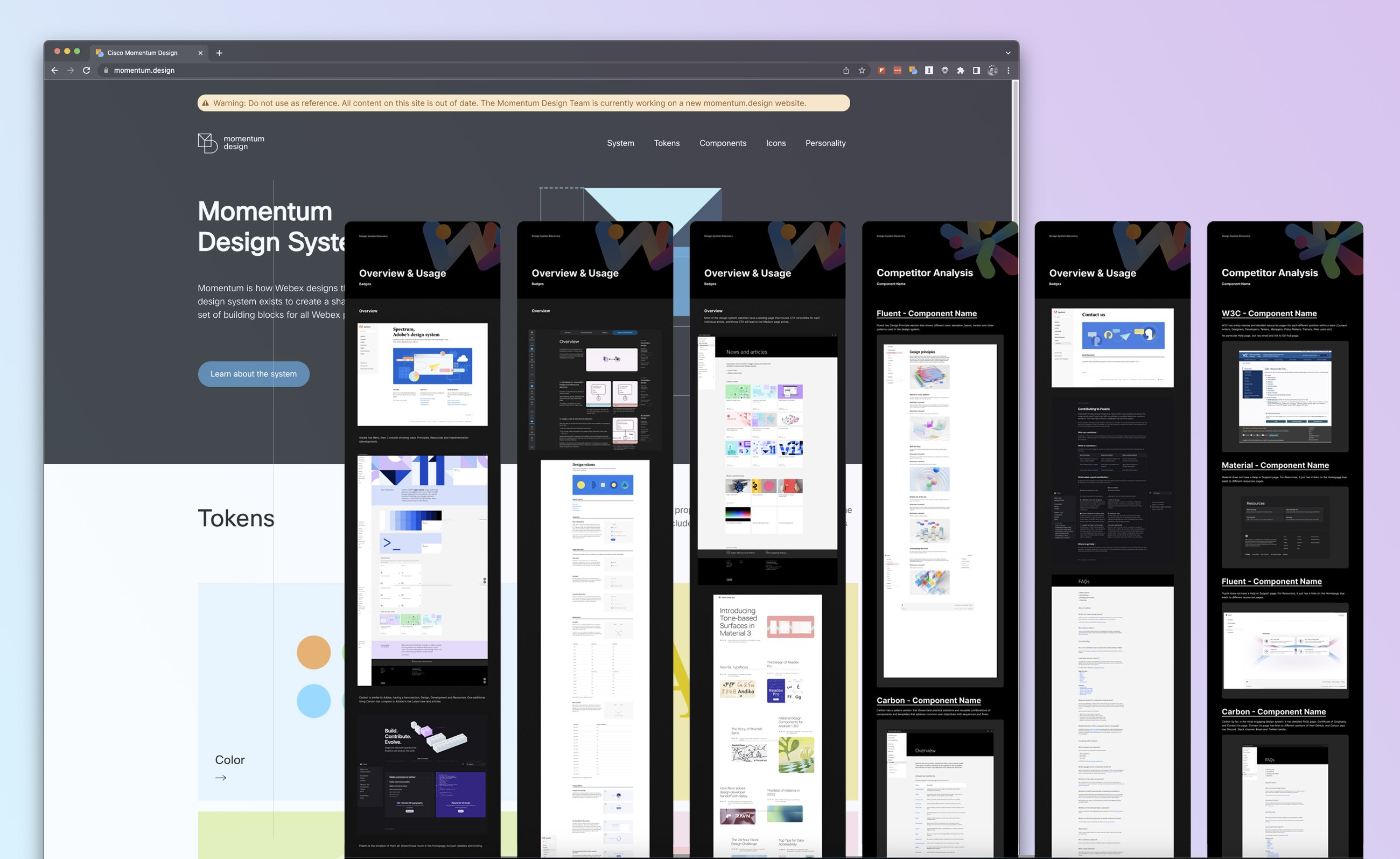
Material, Carbon, Polaris, Apple — competitive analysis for features and depth.
Material, Carbon, Polaris, Apple — competitive analysis for features and depth.
Material, Carbon, Polaris, Apple — competitive analysis for features and depth.
What users need
Color, spacing, and type tokens — designers and engineers across all Webex products.
Color, spacing, and type tokens — designers and engineers across all Webex products.
Color, spacing, and type tokens — designers and engineers across all Webex products.
Communication was bi-weekly stand-ups with the DS team, plus milestone check-ins with the Director of Design and Director of Communication — who contributed significant content and needed three dedicated review sessions.
Communication was bi-weekly stand-ups with the DS team, plus milestone check-ins with the Director of Design and Director of Communication — who contributed significant content and needed three dedicated review sessions.
Communication was bi-weekly stand-ups with the DS team, plus milestone check-ins with the Director of Design and Director of Communication — who contributed significant content and needed three dedicated review sessions.
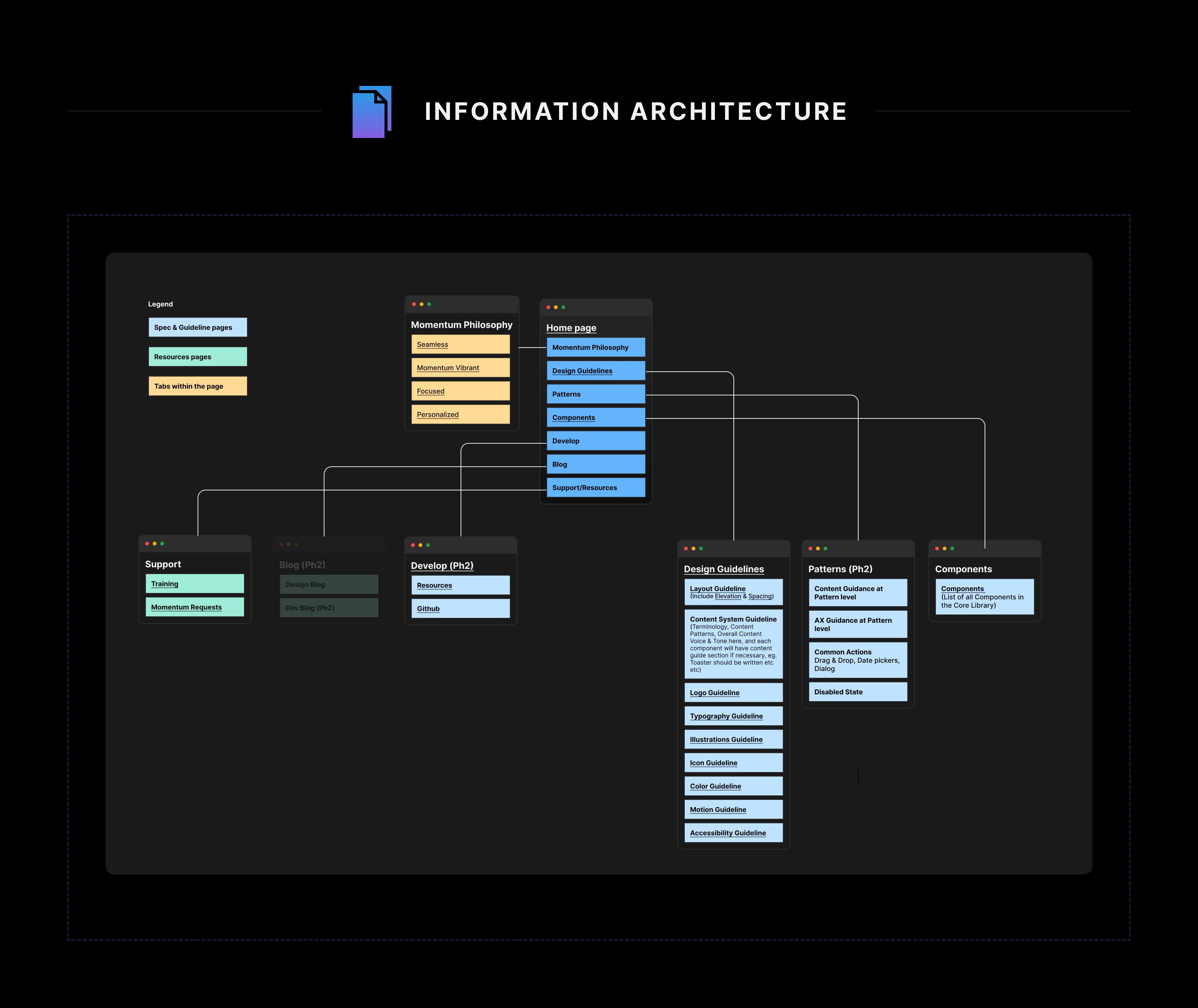
Information architecture
Information architecture
Information architecture
What started as a simple two-section structure — Guidelines and Components — expanded after competitive analysis revealed the need to include brand philosophy, training, support, and a blog. Each section needed its own logic for how users would navigate and find what they need.
What started as a simple two-section structure — Guidelines and Components — expanded after competitive analysis revealed the need to include brand philosophy, training, support, and a blog. Each section needed its own logic for how users would navigate and find what they need.
What started as a simple two-section structure — Guidelines and Components — expanded after competitive analysis revealed the need to include brand philosophy, training, support, and a blog. Each section needed its own logic for how users would navigate and find what they need.
components
Full library, specs, use cases
Full library, specs, use cases
Full library, specs, use cases
guidelines
Grid, color, type, motion, a11y
Grid, color, type, motion, a11y
Grid, color, type, motion, a11y
Brand
Philosophy, logo, illustration
Philosophy, logo, illustration
Philosophy, logo, illustration
Training
How-tos, Figma guides, file hygiene
How-tos, Figma guides, file hygiene
How-tos, Figma guides, file hygiene
DESIGN
DESIGN
DESIGN
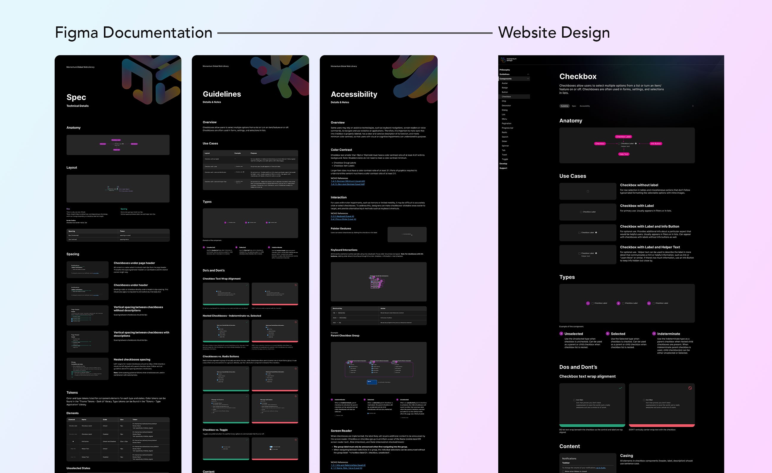
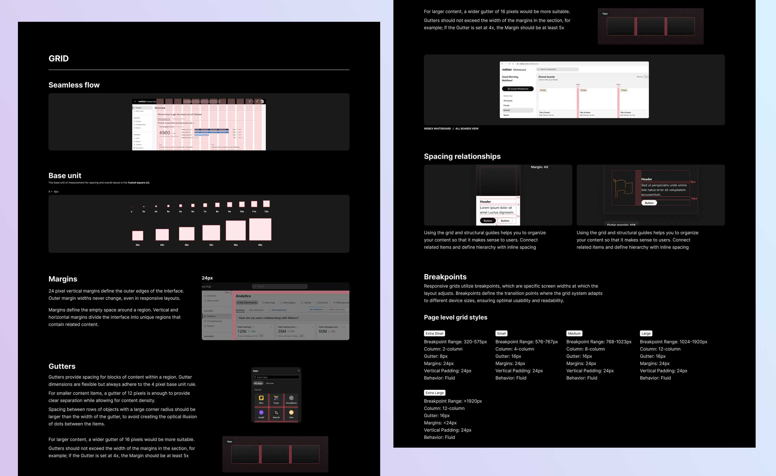
Dark mode as default — staying within the Momentum rebrand's visual language. The existing Figma documentation template wasn't built for web, so I created a new one from scratch: spacing, typeface, sizing, and grid all defined for screen rendering.
Dark mode as default — staying within the Momentum rebrand's visual language. The existing Figma documentation template wasn't built for web, so I created a new one from scratch: spacing, typeface, sizing, and grid all defined for screen rendering.
Dark mode as default — staying within the Momentum rebrand's visual language. The existing Figma documentation template wasn't built for web, so I created a new one from scratch: spacing, typeface, sizing, and grid all defined for screen rendering.
Content migration was the biggest challenge — guidelines created at different times had inconsistent color tokens, typefaces, spacing, and font sizes. The new template made it systematic rather than case-by-case.
Content migration was the biggest challenge — guidelines created at different times had inconsistent color tokens, typefaces, spacing, and font sizes. The new template made it systematic rather than case-by-case.
Content migration was the biggest challenge — guidelines created at different times had inconsistent color tokens, typefaces, spacing, and font sizes. The new template made it systematic rather than case-by-case.
Engineering — Figma to web pipeline
Engineering — Figma to web pipeline
Engineering — Figma to web pipeline
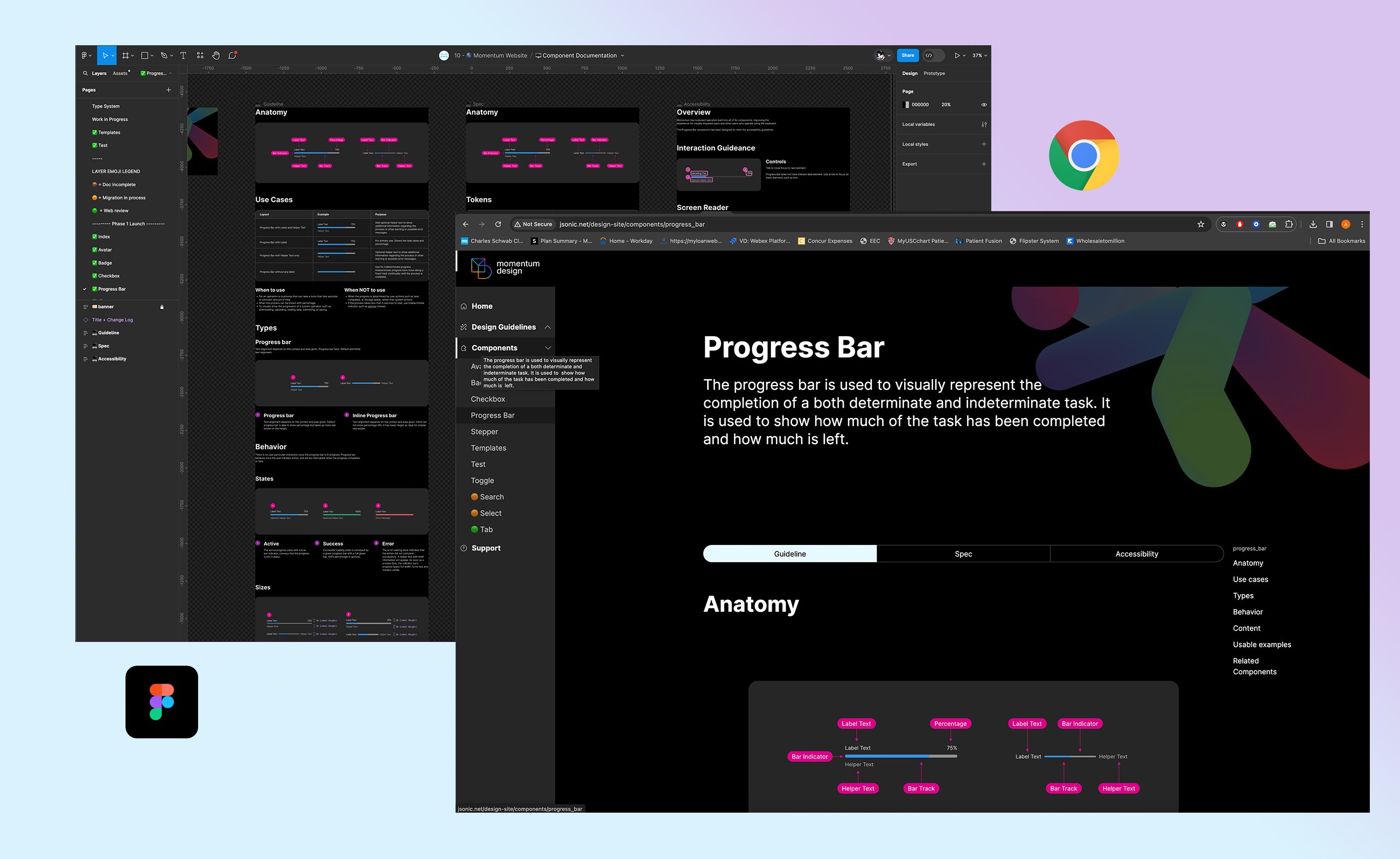
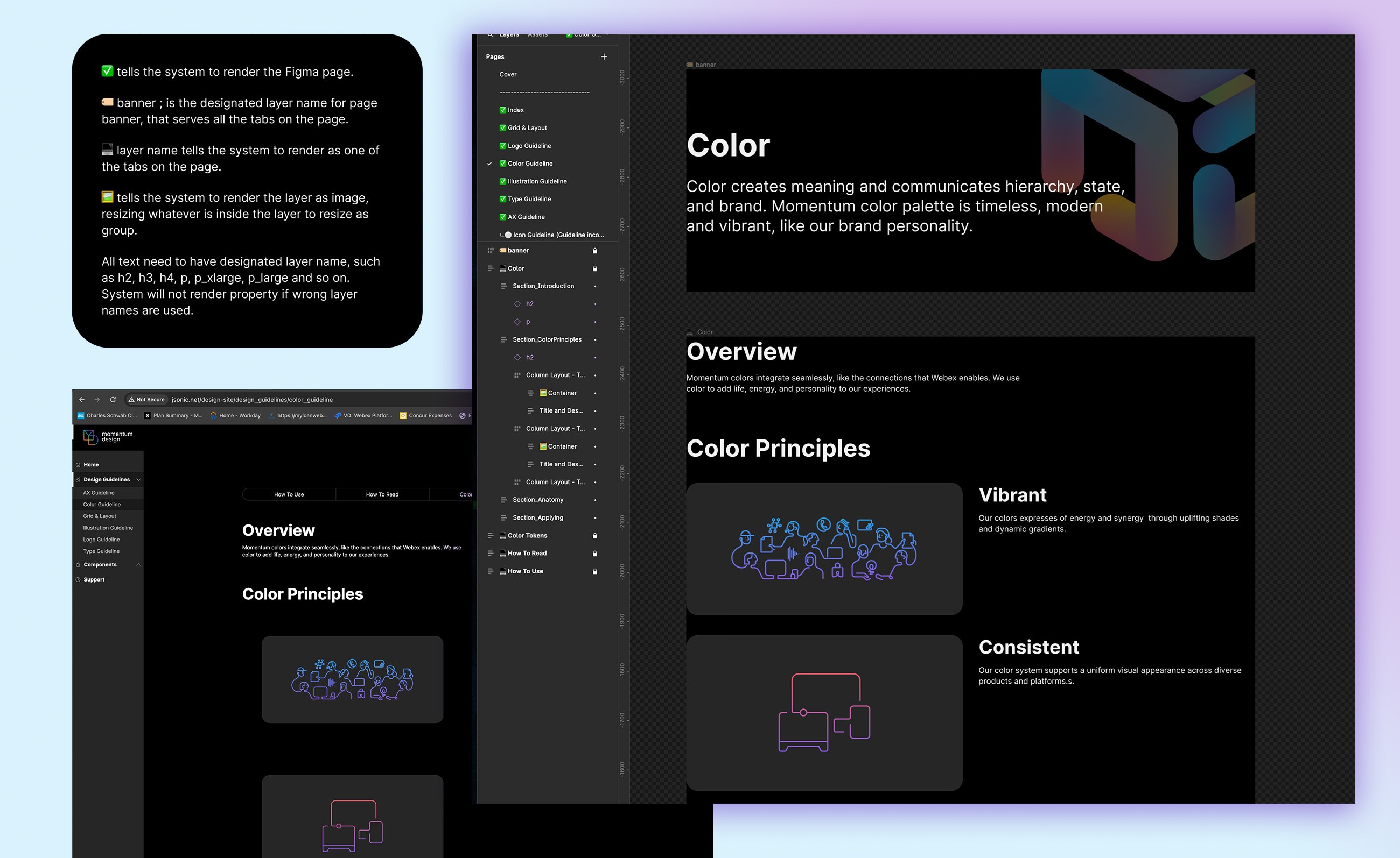
The most technically complex part of the project: enabling designers to publish and update the site without engineering intervention. The engineer built a Git-based rendering pipeline that could read Figma layer names and auto-layout rules and translate them directly to the web.
The most technically complex part of the project: enabling designers to publish and update the site without engineering intervention. The engineer built a Git-based rendering pipeline that could read Figma layer names and auto-layout rules and translate them directly to the web.
The most technically complex part of the project: enabling designers to publish and update the site without engineering intervention. The engineer built a Git-based rendering pipeline that could read Figma layer names and auto-layout rules and translate them directly to the web.
Layer naming rules
Layer naming rules
Specific emoji prefixes on layer names signal type hierarchy, images, pages, and tabs to the backend.
Specific emoji prefixes on layer names signal type hierarchy, images, pages, and tabs to the backend.
Specific emoji prefixes on layer names signal type hierarchy, images, pages, and tabs to the backend.
Auto-layout properties
Auto-layout properties
Correct auto-layout settings ensure responsive behavior renders properly on the web.
Correct auto-layout settings ensure responsive behavior renders properly on the web.
Correct auto-layout settings ensure responsive behavior renders properly on the web.
Git Submission
Git Submission
Designers submit a work order via Git — the backend grabs the Figma file, parses layer names, and renders the page.
Designers submit a work order via Git — the backend grabs the Figma file, parses layer names, and renders the page.
Designers submit a work order via Git — the backend grabs the Figma file, parses layer names, and renders the page.
QA + training
QA + training
Multiple rounds of trials. Once stable, I trained all other designers on the template and QA'd every page for consistency.
Multiple rounds of trials. Once stable, I trained all other designers on the template and QA'd every page for consistency.
Multiple rounds of trials. Once stable, I trained all other designers on the template and QA'd every page for consistency.
Next step: the engineering team is building a Figma plugin to automate the GitHub pull — currently designers trigger it manually one page at a time.
Next step: the engineering team is building a Figma plugin to automate the GitHub pull — currently designers trigger it manually one page at a time.
Next step: the engineering team is building a Figma plugin to automate the GitHub pull — currently designers trigger it manually one page at a time.
Logo & grid
Logo & grid
Logo & grid
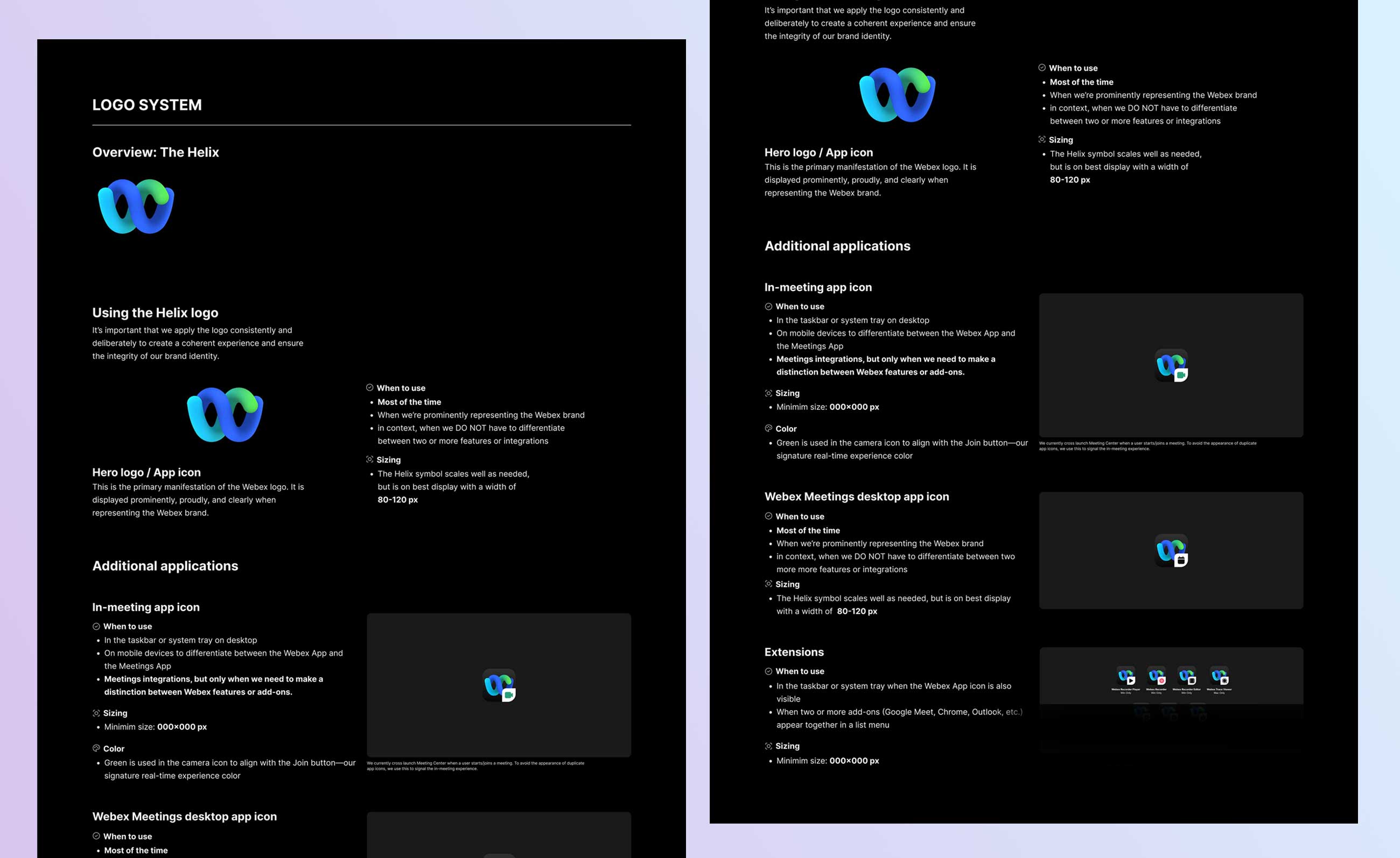
Logo System
Logo System
Webex Helix documented and standardized — usage rules established to build brand equity across all Webex products.
Webex Helix documented and standardized — usage rules established to build brand equity across all Webex products.
Webex Helix documented and standardized — usage rules established to build brand equity across all Webex products.
Grid System
Grid System
Base unit scaling for columns, gutters, spacing. Rhythm and balance through repeating alignment patterns. White space reduces container clutter.
Base unit scaling for columns, gutters, spacing. Rhythm and balance through repeating alignment patterns. White space reduces container clutter.
Base unit scaling for columns, gutters, spacing. Rhythm and balance through repeating alignment patterns. White space reduces container clutter.
OUTCOME
Outcome
OUTCOME
Design systems are never finished — they evolve alongside the products they serve. Here's where we landed.
Design systems are never finished — they evolve alongside the products they serve. Here's where we landed.
Design systems are never finished — they evolve alongside the products they serve. Here's where we landed.
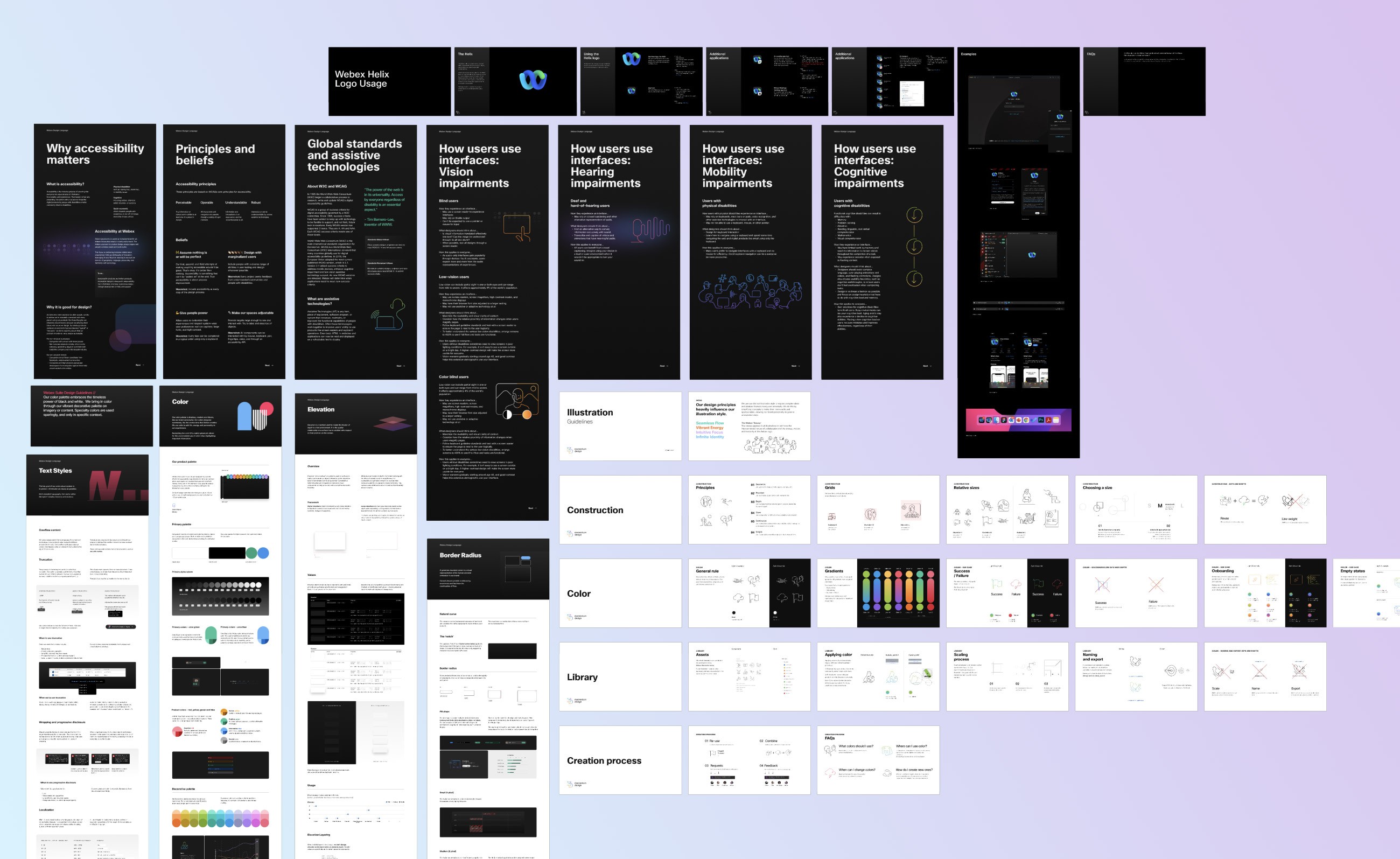
· 39 components audited — 34 rebranded & documented, 4 deprecated, 5 new added
· Dark Mode shipped for the first time in Momentum's history
· 508-compliant library with mandatory A11y review now standard process
· New type system, color tokens, grid, and logo guidelines fully documented
· Component Documentation Template + Guidelines established for all future work
· Training created for implementation, file hygiene, updating, and product use cases
· All documentation migrated to Momentum Design System website for self-serve access