
Design systems - Cisco Webex
Design systems - Cisco Webex
Momentum Design System Rebrand
Momentum Design System Rebrand
Momentum Design System Rebrand
Momentum Design Systems Team
CONTACT NOW
Component Design & Documentation
CONTACT NOW
2022-2024
CONTACT NOW
Design Systems
CONTACT NOW
Webex had no single source of truth. Different product teams were building components independently — leading to inconsistency, duplicated effort, and no clear ownership. The Momentum rebrand was built to fix this: one system, atomic by design, accessible by default.
Webex had no single source of truth. Different product teams were building components independently — leading to inconsistency, duplicated effort, and no clear ownership. The Momentum rebrand was built to fix this: one system, atomic by design, accessible by default.
Webex had no single source of truth. Different product teams were building components independently — leading to inconsistency, duplicated effort, and no clear ownership. The Momentum rebrand was built to fix this: one system, atomic by design, accessible by default.
goals
goals
GOALS
· Establish one component standard across all Webex design teams
· Rebuild using Atomic Design methodology in Figma from scratch
· Add Dark Mode — absent in legacy system, requested by ~70% of engineering users
· Achieve WCAG/508 compliance on every component via A11y partner review
· Document everything so any designer could implement correctly
Focus & Strategy
Focus & Strategy
Focus & Strategy
Two systems in use: Admin Design System and Legacy Momentum. We prioritized Legacy Momentum as the foundation, integrating Admin elements where missing. Competitive analysis: Google Material, IBM Carbon, Shopify Polaris.
Two systems in use: Admin Design System and Legacy Momentum. We prioritized Legacy Momentum as the foundation, integrating Admin elements where missing. Competitive analysis: Google Material, IBM Carbon, Shopify Polaris.

Atomic System
Atomic System
Atomic System

Built from scratch in Figma using Atomic Design methodology — starting from atoms up through molecules and organisms. Maximizes consistency, reusability, and cross-team collaboration.
Built from scratch in Figma using Atomic Design methodology — starting from atoms up through molecules and organisms. Maximizes consistency, reusability, and cross-team collaboration.
Dark Mode & Accessibility
Dark Mode & Accessibility
Dark Mode & Accessibility
Dark Mode
Absent from the legacy system. ~70% of engineers prefer it. Made it a day-one priority, not an afterthought.
Absent from the legacy system. ~70% of engineers prefer it. Made it a day-one priority, not an afterthought.
Accessibility
Partnered with A11y specialists from Applause. Mandatory review gate — no component ships without a full accessibility check.
Partnered with A11y specialists from Applause. Mandatory review gate — no component ships without a full accessibility check.

renewed system
renewed system
renewed system

39 components audited — 34 rebranded and documented, 4 deprecated, 5 new added. Also created a Component Documentation Template and Guidelines covering content order, spacing, padding, responsive design, and a new type system.
39 components audited — 34 rebranded and documented, 4 deprecated, 5 new added. Also created a Component Documentation Template and Guidelines covering content order, spacing, padding, responsive design, and a new type system.
Color & Tyopography
Color & Tyopography
Color & Tyopography
Color System
Black/white foundation, alpha-state depth tokens, accessibility-mapped shade pairs, decorative palette for data viz and illustration.
Black/white foundation, alpha-state depth tokens, accessibility-mapped shade pairs, decorative palette for data viz and illustration.
Typography
Replaced CiscoSansTT with Inter — screen-optimized, variable font, superior ClearType on Windows, strong language support globally.
Replaced CiscoSansTT with Inter — screen-optimized, variable font, superior ClearType on Windows, strong language support globally.

Logo & grid
Logo & grid
Logo & grid
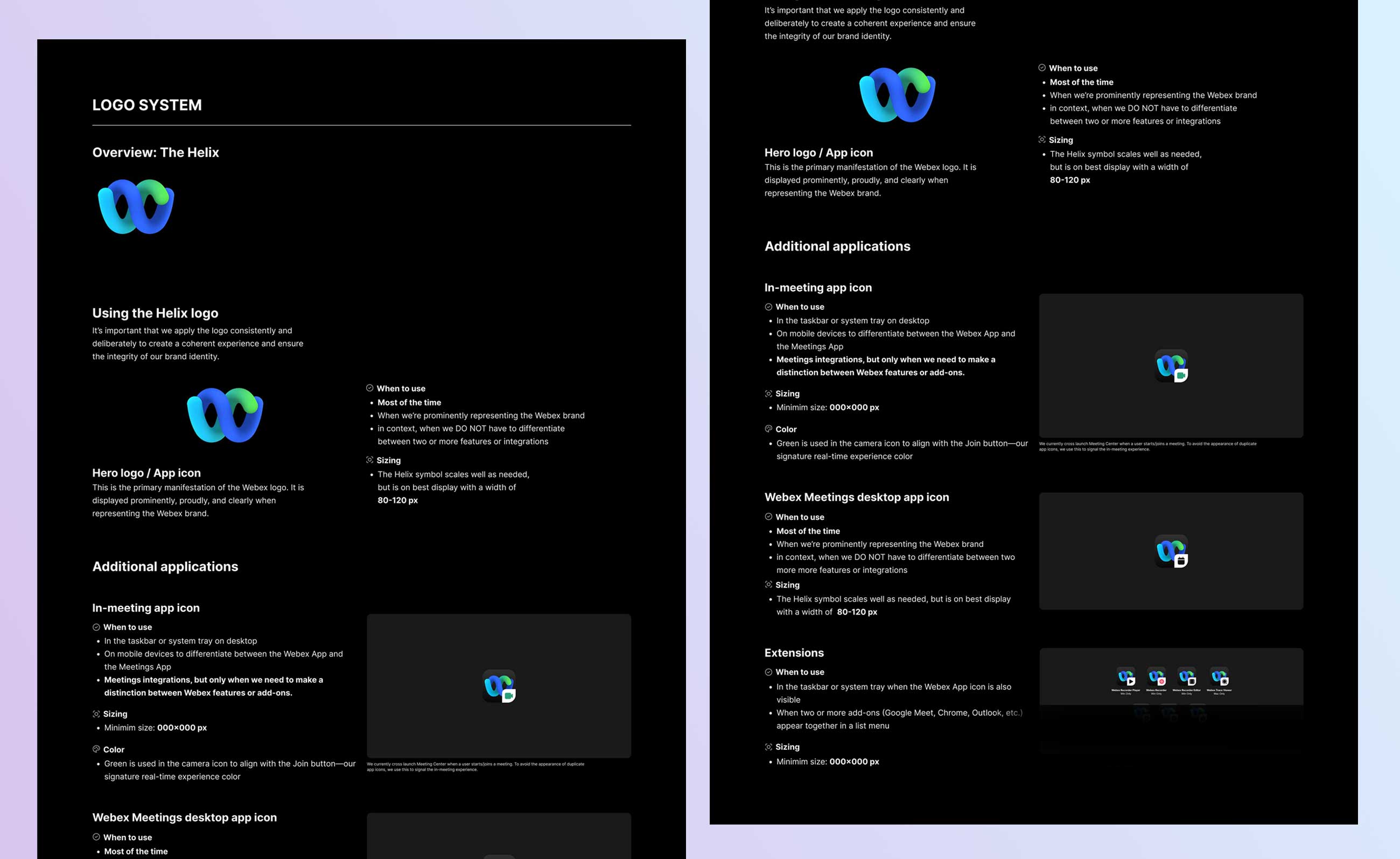
Logo System
Webex Helix documented and standardized — usage rules established to build brand equity across all Webex products.
Webex Helix documented and standardized — usage rules established to build brand equity across all Webex products.
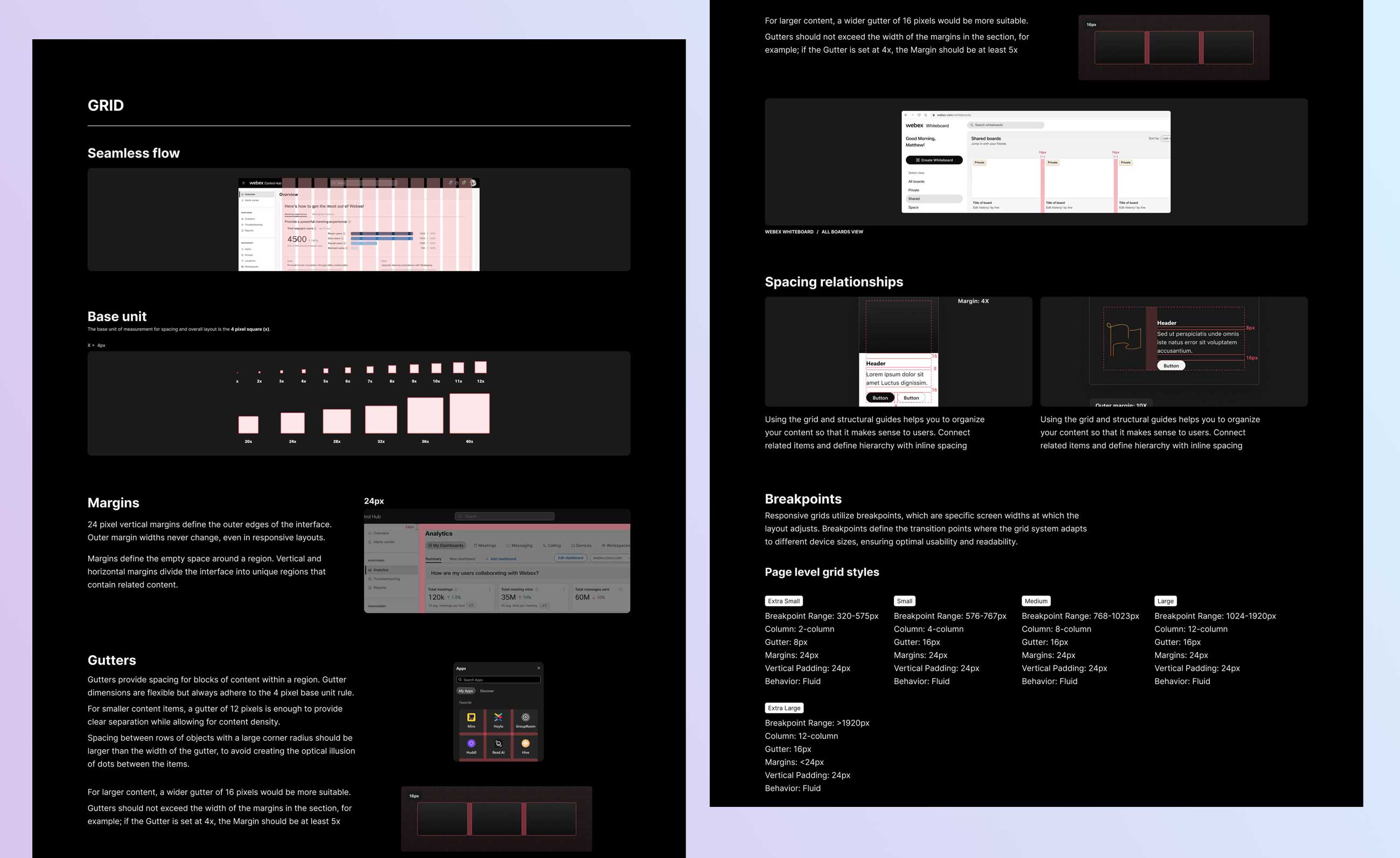
Grid System
Base unit scaling for columns, gutters, spacing. Rhythm and balance through repeating alignment patterns. White space reduces container clutter.
Base unit scaling for columns, gutters, spacing. Rhythm and balance through repeating alignment patterns. White space reduces container clutter.
OUTCOME
OUTCOME
GOALS
Design systems are never finished — they evolve alongside the products they serve. Here's where we landed.
Design systems are never finished — they evolve alongside the products they serve. Here's where we landed.
· 39 components audited — 34 rebranded & documented, 4 deprecated, 5 new added
· Dark Mode shipped for the first time in Momentum's history
· 508-compliant library with mandatory A11y review now standard process
· New type system, color tokens, grid, and logo guidelines fully documented
· Component Documentation Template + Guidelines established for all future work
· Training created for implementation, file hygiene, updating, and product use cases
· All documentation migrated to Momentum Design System website for self-serve access