WORKS

Momentum Design Website

Brief

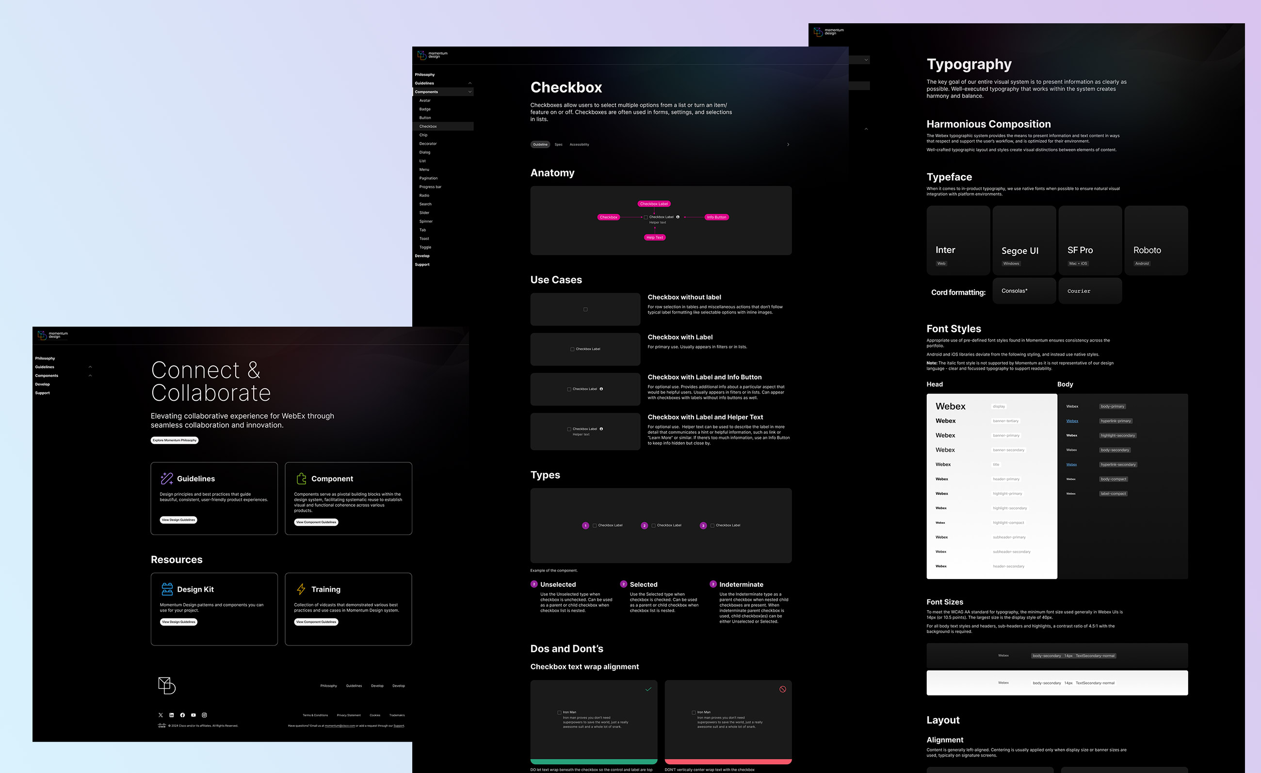
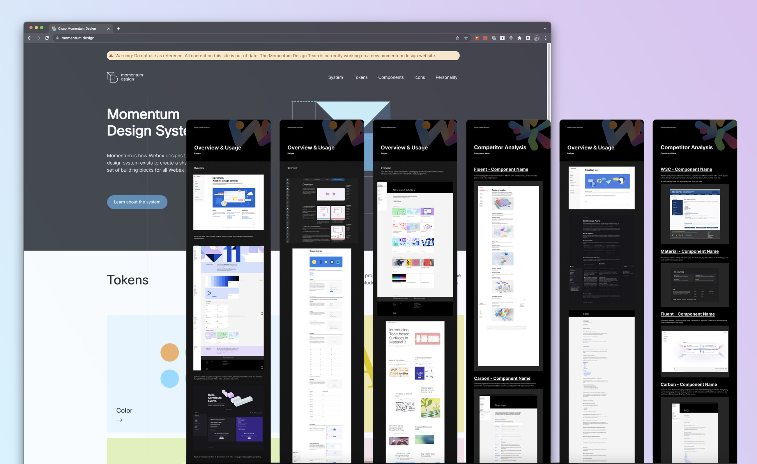
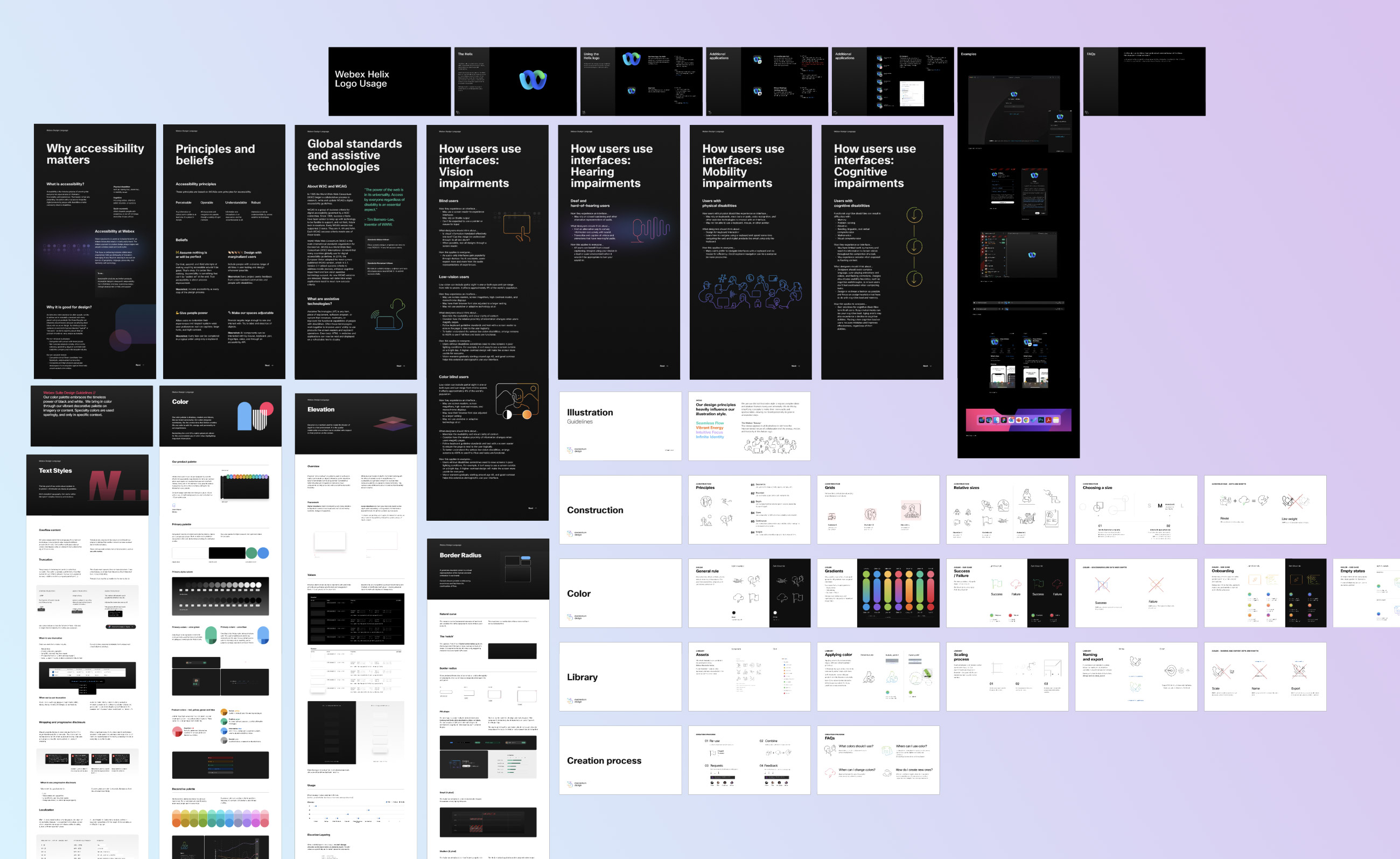
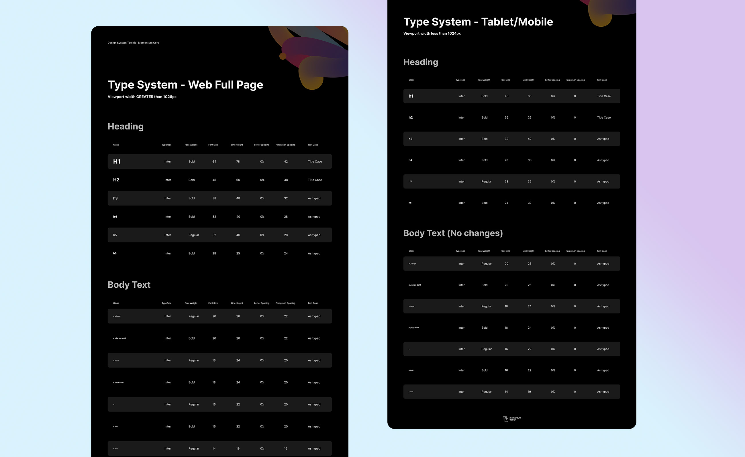
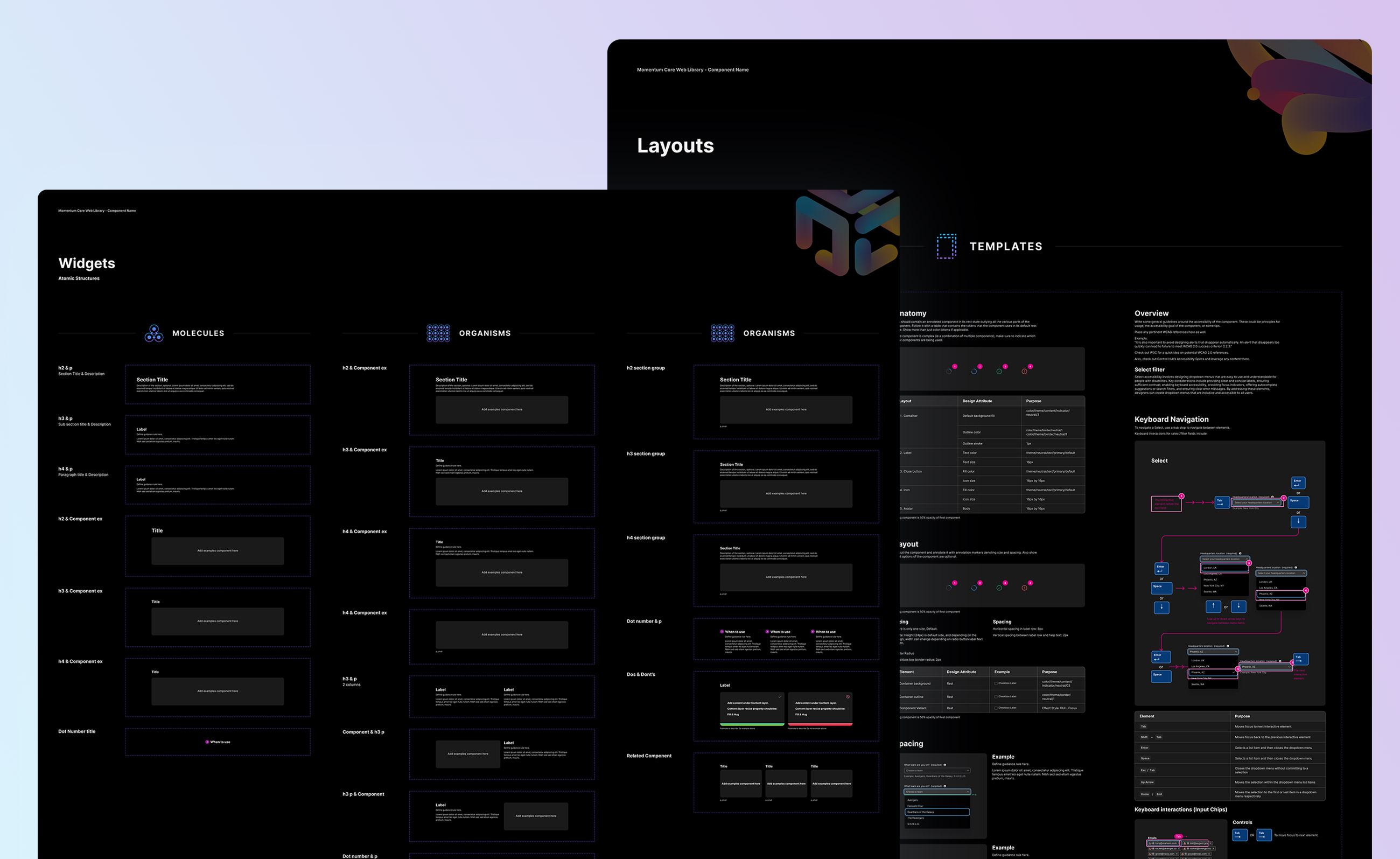
Momentum Design system website has been outdated for a long time and update was long overdue. With the new complete rebarnd of the design system components, this new website will be dedicated to system documentation.

This will be the single source of truth for all designers, engineers, and other stakeholders interested in learning more about Momentum and it’s application into product.

Created at:

Momentum Design Team

Project

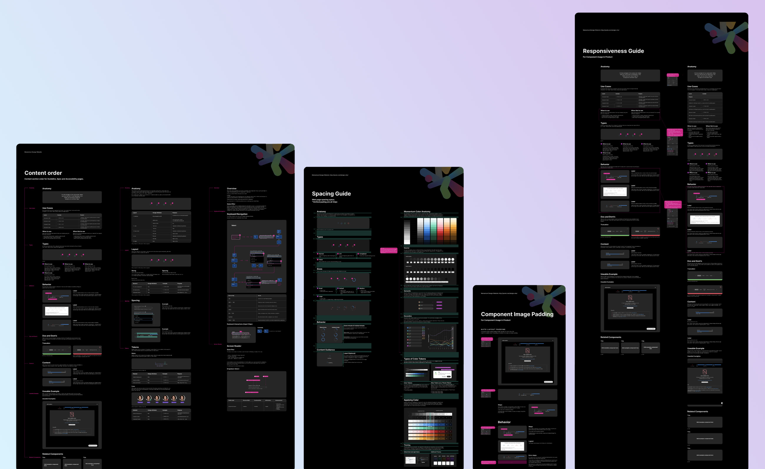
Designers on the Momentum team must be able to update and maintain information on the site without the help of engineers. We want to eliminate as many roadblocks as possible to updating website content.

Role

Head Designer

Team

Momentum Design Team
Development Lead: Arthus Huang

Process

Audit Current site

We started by auditing and dissecting down the existing website. I wanted to compare the new contents that are available to me for the new website, and what is currently on the outdated site.

We do not have to have all the same pages and topics, but I wanted to see what we can keep, update, or eliminate from the current site.

Competitive analysis

I have reviewed Google Material, IBM Carbon, Shopify Polaris, Adobe Spectrum and Salesforce Lighting.

Competitive analysis

I have reviewed Google Material, IBM Carbon, Shopify Polaris, Adobe Spectrum and Salesforce Lighting.

Process

Content gathering

The contents for the Guidelines pages were all created in Figma by different designers. These figma files were not created with web in mind, so I had to gather them and restructure them to fit on web-format.

I also had to go through all the content to make sure they were irrelevant, representing best practices, Momentum philosophy, and are in fact useful.

Process

Type system

All of the Figma files were created using different type sizes and typefaces. The guideline files were created at different times, so they had to share a single system. I have researched and created a type system that is best equipped and fit for the modern web best practice.

Process

Template creation

After having the Type components at the atomic level, I was able to make more combinations of text system and also text + image combinations as well. I wanted to create a component and variants of these but the code system we have in place actually reads the layer names to render different type classes, so the components had to be unique to its own.

With the template, I was able to create a system and consistent spacing and margins for the website template. Using this template, the designers can easily plug in their content and it will be web-ready.

Guidelines

From page width to type size, everything had to be resized from the current Documentation Template. It was great opportunity to audit the current documentation files to set up rules to keep all the pages consistent.

I wanted to create a full guideline that explains to other designers what has changed, what to look for when migrating current documentation to web-format, and best practice to have the right properties for proper rendering

Process

Migration

Using the template I built, I started the migration process. Some of the pain points were lot of copy-pasting, and figuring out the proper settings in Figma. It felt like I was doing the front-end work through Figma settings, and I had to test out each of the width and height settings in Figma.

Also having the right image auto-layout properties took some time to figure out the proper settings, as back-end code developed, the Figma setting also had to be adjusted accordingly.

Quality assurance

I had to go through a series of trial and error with the spacing and type sizing, as the design on Figma and the rendered design on the website were not identical.

Because the template and spacing have been updated several times, I had to make sure all the type sizes and spacing are consistent throughout all the pages.

Integration

Pros

Designers can control front-end from Figma, including responsive stacking.

Cons

Trial and Error, some designs need to be hardcoded, such as page background image, menu, header, and footer. Github work-order takes a bit of time when rendering.

Next step

Engineers will be building a Figma plug-in that allows the designers to deploy the design to the web without leaving Figma.