WORKS

Momentum Design System
Component and Documentation

Brief

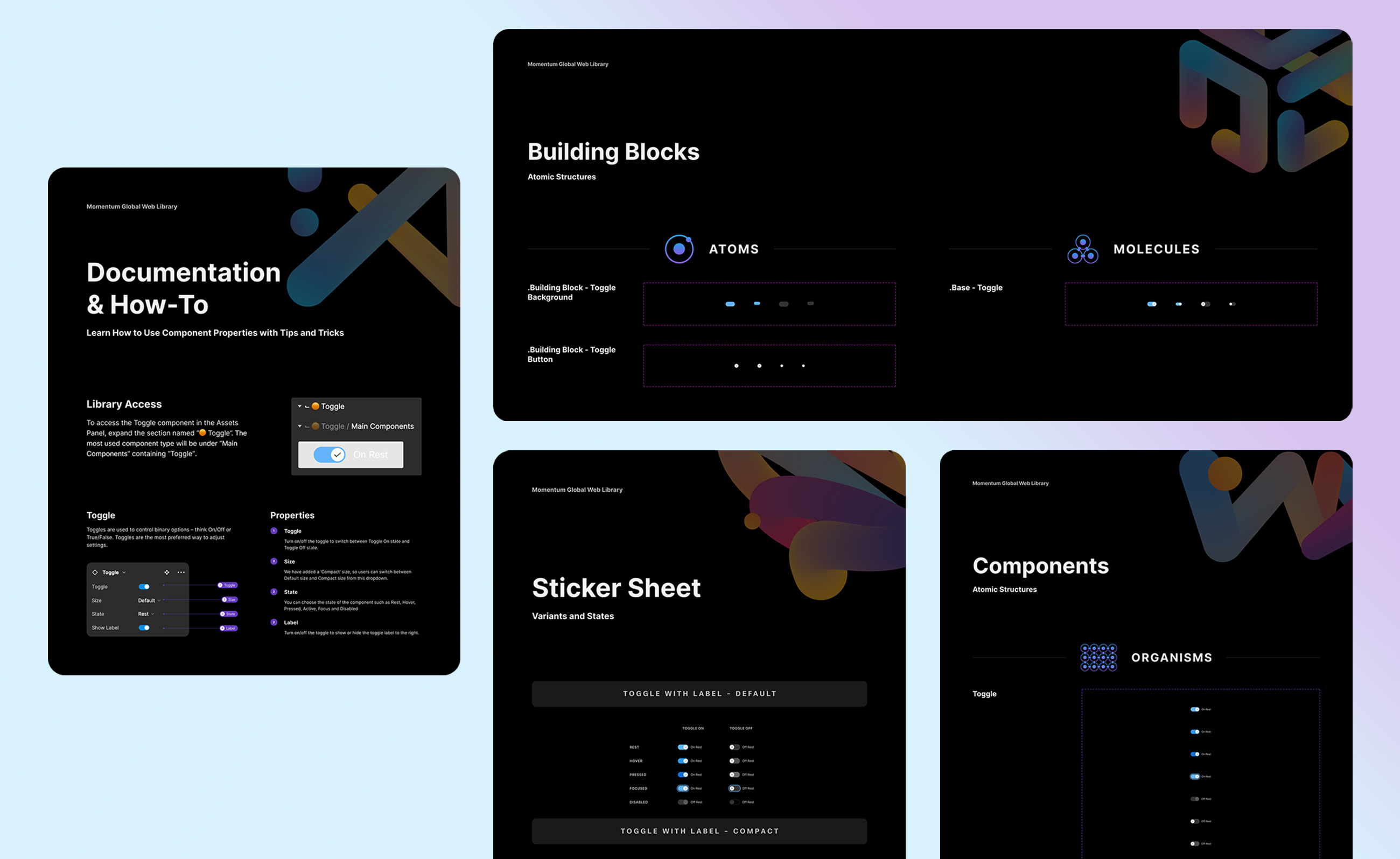
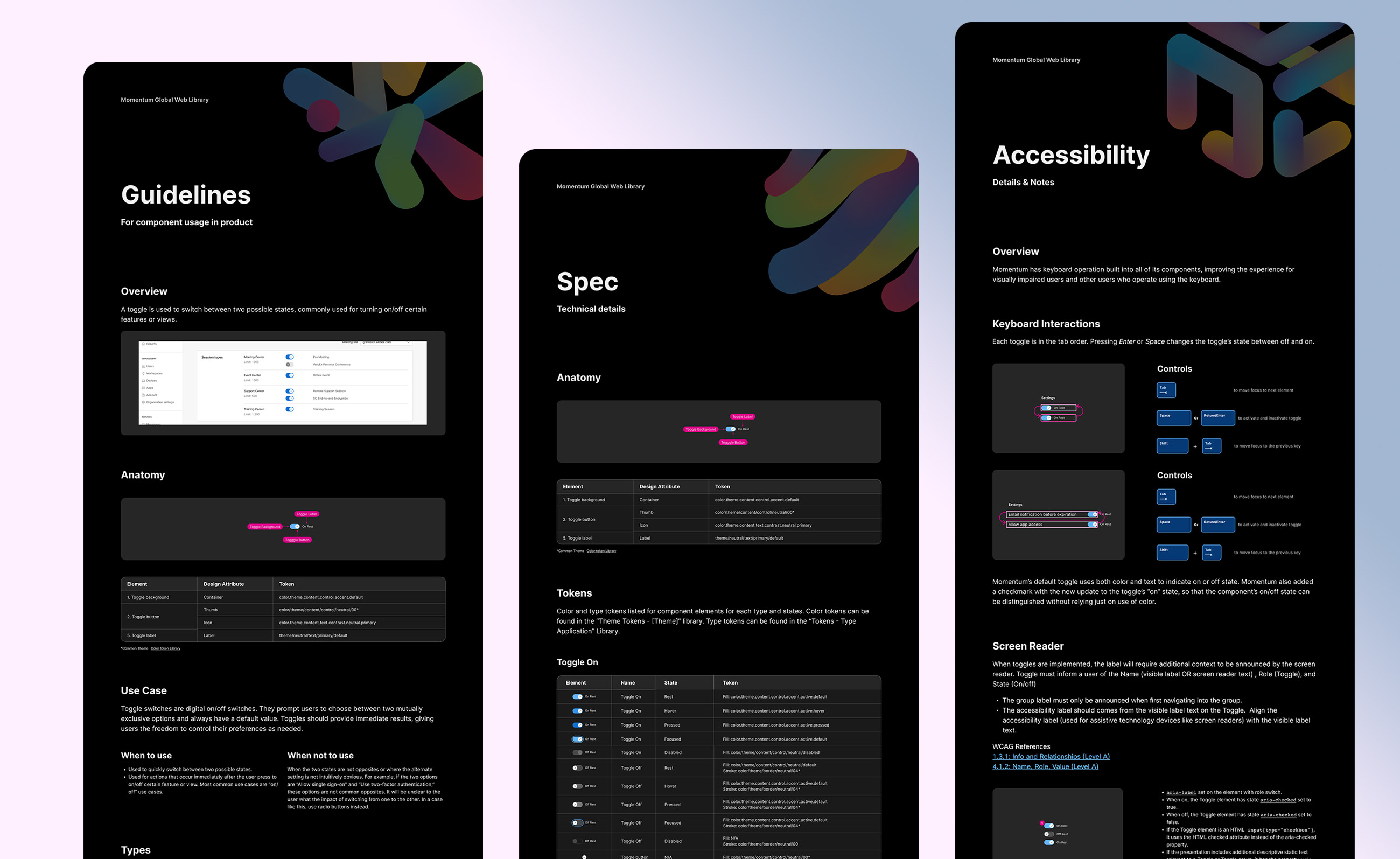
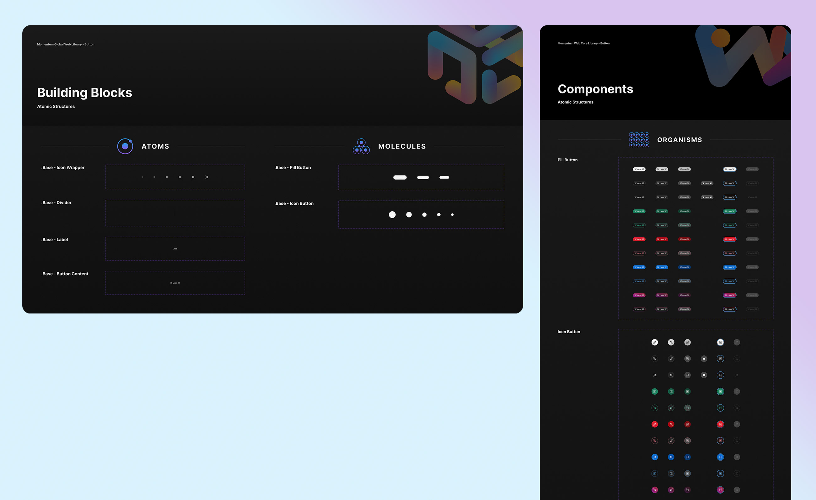
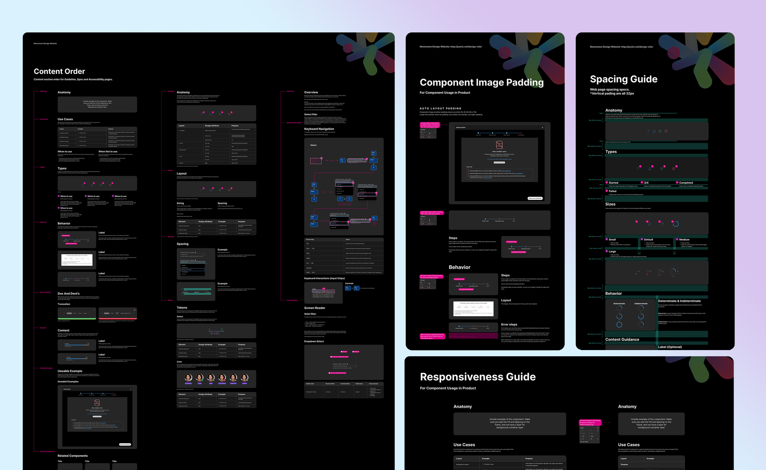
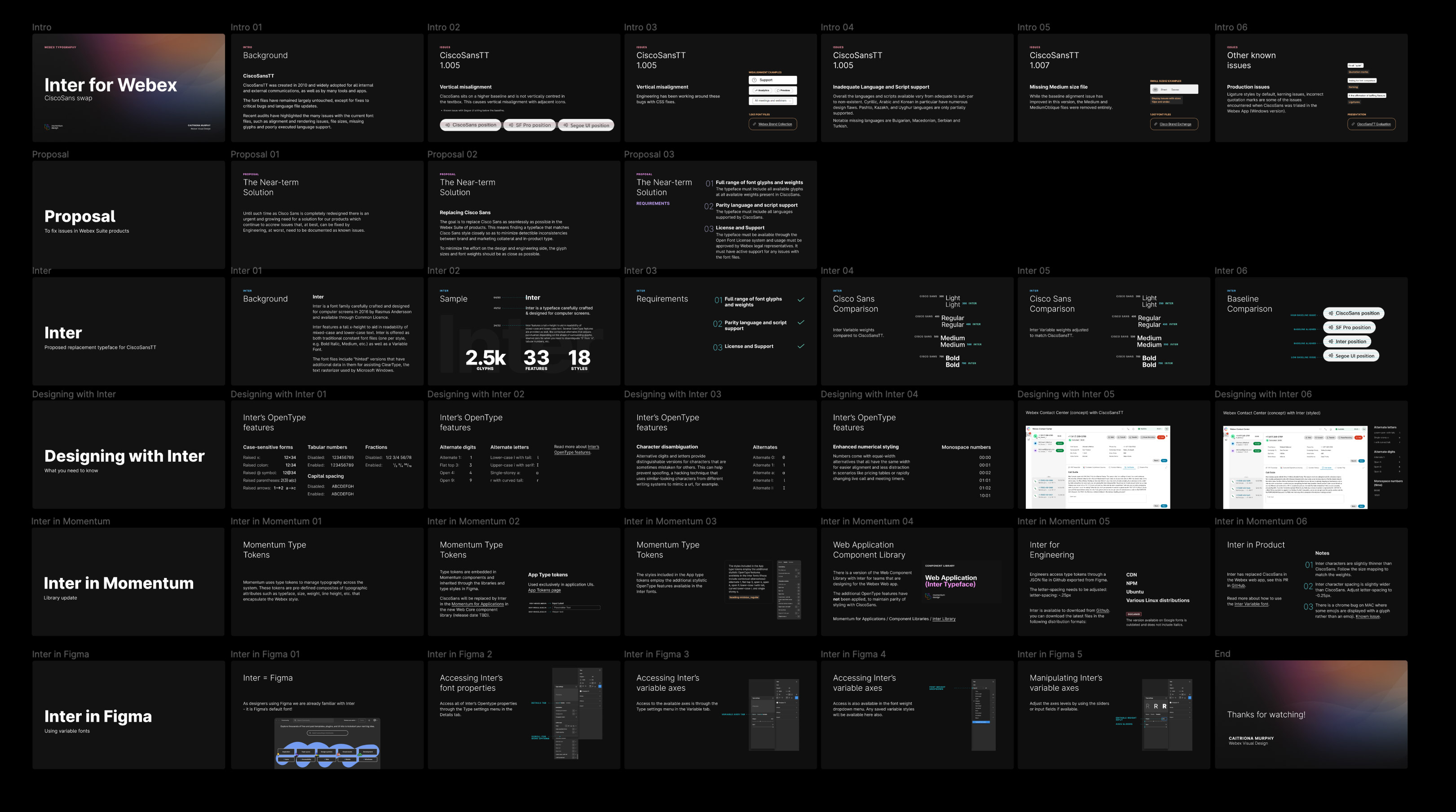
We rebuilt our Momentum Design System to update outdated technology, enhance to fit all of our collaboration products, improve usability, scalability, and A11y accessibility.

Created at:

Momentum Design Systems Team

Project

Momentum Design team is undergoing a full rebrand of the Momentum Design system that serves all collaborative products. Through meticulous auditing and adding detailed documentation, we've gathered information on all UI components used in our products. Once finalized, this redesigned system will become the standard across all Webex Products, ensuring consistency and efficiency in our design processes.

Role

Component Design, Component Documentation, Component QC

Problem

Simply put, we did not have a consistent design system, single source of truth created to serve all Momentum products.

As a results of that, different product teams had different component to fit their needs, resulting in messy, inconsistent design. There was also lack of communication among teams, to share any components or guidelines, and often times, no one really knew who made which component

Goals

  • Design standards
  • As mentioned, because every team was making their own component, we needed to set a standard that needed to be followed across all design teams, from planning, researching, creating, reviewing, and shipping

  • Process
  • We want to set up a process where designers are empowered and free to contribute. The components has to be easy to maintain and update for the creators, and easy to use for the users.

  • Industry standard
  • The new design system has to be up to industry standard with best practice, design trends and most importantly accessibility

  • Documentation
  • To eliminate the inconsistency and help the users use the components in a proper way, through, detailed documentation and how-to was necessary

    Execution

    The team started by dissecting all of the components. We took the Atomic Design approach, by rebuilding the component starting from Atoms, then Molecules, to Organism, and Templates if necessary.

    Each of our designers started by learning Atomic Design System principle, as it can provide great benefit to the design system. Atomic design enables the designers to have consistency, scalability, reusability, and better collaboration.

    Dark Mode

    For the rebrand, we also implemented the Dark mode, which was not available on the current system.

    According to the research, about 70% of software engineers prefer working in Dark mode, so it seems natural for them to create tools with dark backgrounds and colored text. Also research team got lot of user feedback from customers wanting dark mode. Dark mode also helps you save battery life, reduce blue light, which will reduce any stress on the eyes from the screen.

    Renewed System

    As a team we have audited total of 39 components, deprecated 4 components, added 5 new components

    From the 39 components audited, 34 of the components got rebranded and documented.

    During the rebrand process, we have also create Component Documentation template, and Guidelines that sets rules for Content order, Spacing, Component example padding, responsiveness design and new Type system.

    Typography

    CiscoSansTT was created in 2010 and widely adopted for all internal and external communications, as well as by many tools and apps. Recent audits have highlighted the many issues with the current font files, such as alignment and rendering issues, file sizes, missing glyphs and poorly executed language support.

    Inter is a font family carefully crafted and designed for computer screens and available through Common License. Inter features a tall x-height to aid in readability of mixed-case and lower-case text. Inter is offered as both traditional constant font files (one per style, e.g. Bold Italic, Medium, etc.) as well as a Variable Font. The font files include "hinted" versions that have additional data in them for assisting ClearType, the text rasterizer used by Microsoft Windows.

    Results

    Design Systems are always evolving and getting updated. It serves multiple products and designers, so we are constantly getting requests for updates, new components and reviews. What I showed here is just a portion of what goes into a complete design system. A complete system contains the following:

    Documentation

    Full details on how to use, implement in figma, use cases and specs.

    Guidelines

    Includes layout, tone and voice, content style, color tokens, type tokens and more

    Training

    We have also created training on how the components were built, implementing on figma, updating, file hygiene and product use cases

    Website

    We are also putting all the documentation information on the Momentum Design System website, so designers can have easier access to the documentation.